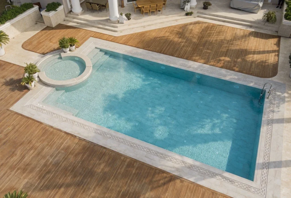
Not Just a Color, But a “Frame Language” Around the Pool
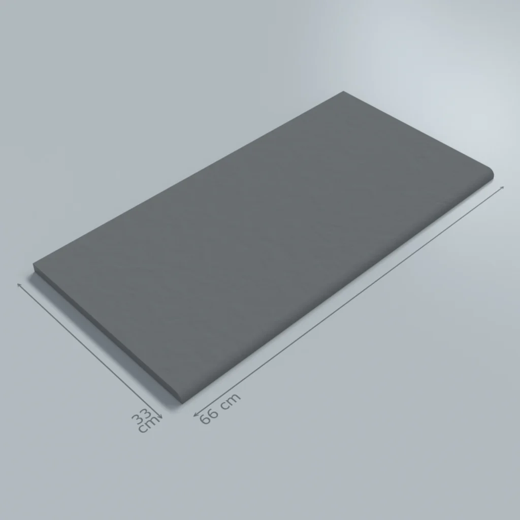
If you’ve come to know the Relax series through tones like Blue, Green, Cobalt or Cemento Grey, you might think of it as “an in-pool color collection.” But Relax Anthracite and Relax White play a different role within the same series: these two tones are the foundation colors of the fullbody porcelain products used not inside the pool, but around it — in overflow systems, grates and pool edges. They are not “in-pool tiles” but the two opposite ends of a technical language that builds the frame of the pool.
This contrast is no accident. Architecturally, the color choice around the pool is far more decisive than the pool itself; the eye reads the frame first and only then focuses on the water. The quiet drama of anthracite and the pure calmness of white create two very different atmospheres within the same system. The same fullbody infrastructure makes two very different design intentions possible.
Relax Anthracite: The Character That Deepens Water
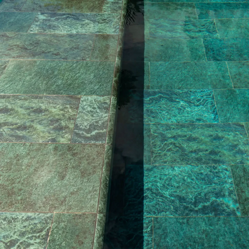
Relax Anthracite is the most strongly characterful color in the collection. When used around the pool, the anthracite tone visibly deepens the color of the water. There’s a physical reason for this: a dark-toned edge reduces the amount of reflected light around the water, making it look more saturated, more “jewel-like.” That’s why Relax Anthracite is the go-to choice in luxury hotel pools, designs focused on nighttime use, and projects where dramatic lighting takes center stage.
The Relax Anthracite family includes all the functional components of the pool surround:
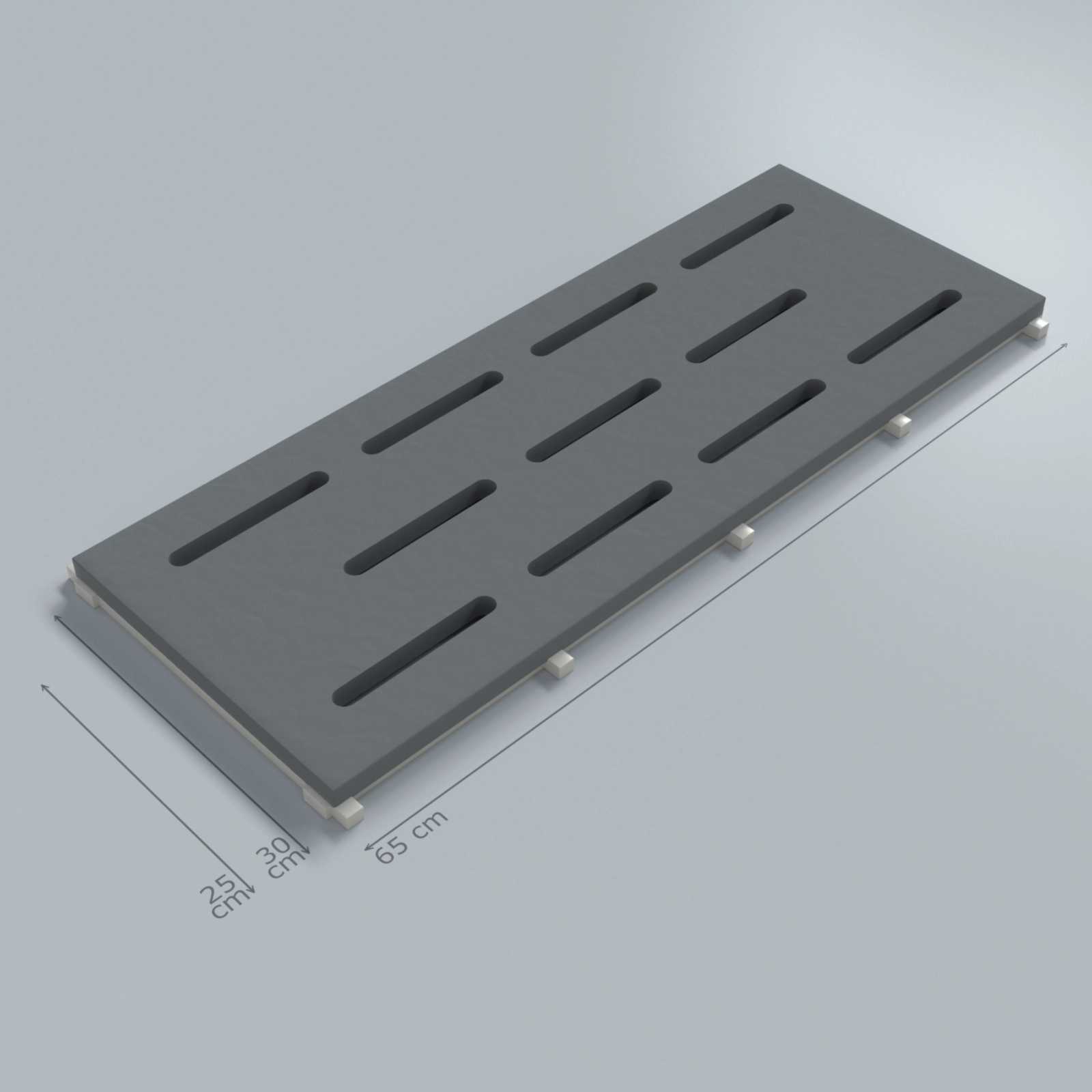
- Grate solutions: Relax Anthracite fullbody monoblock grate and Relax Anthracite fullbody hidden grate — either concealing the overflow channel or turning it into a clear architectural line.
- Linear overflow systems: Relax Anthracite fullbody hidden overflow coping and Relax Anthracite fullbody hidden overflow porcelain pool tile — sharpening the geometry on long, linear overflow pools.
When these products come together as a family, the entire pool surround is built within a single dark tone, automatically pushing the pool’s color forward.
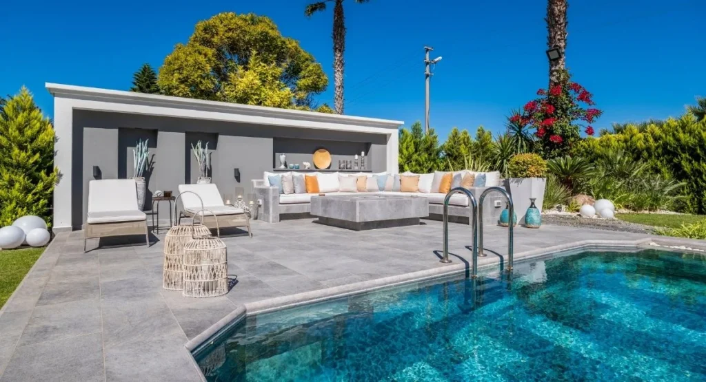
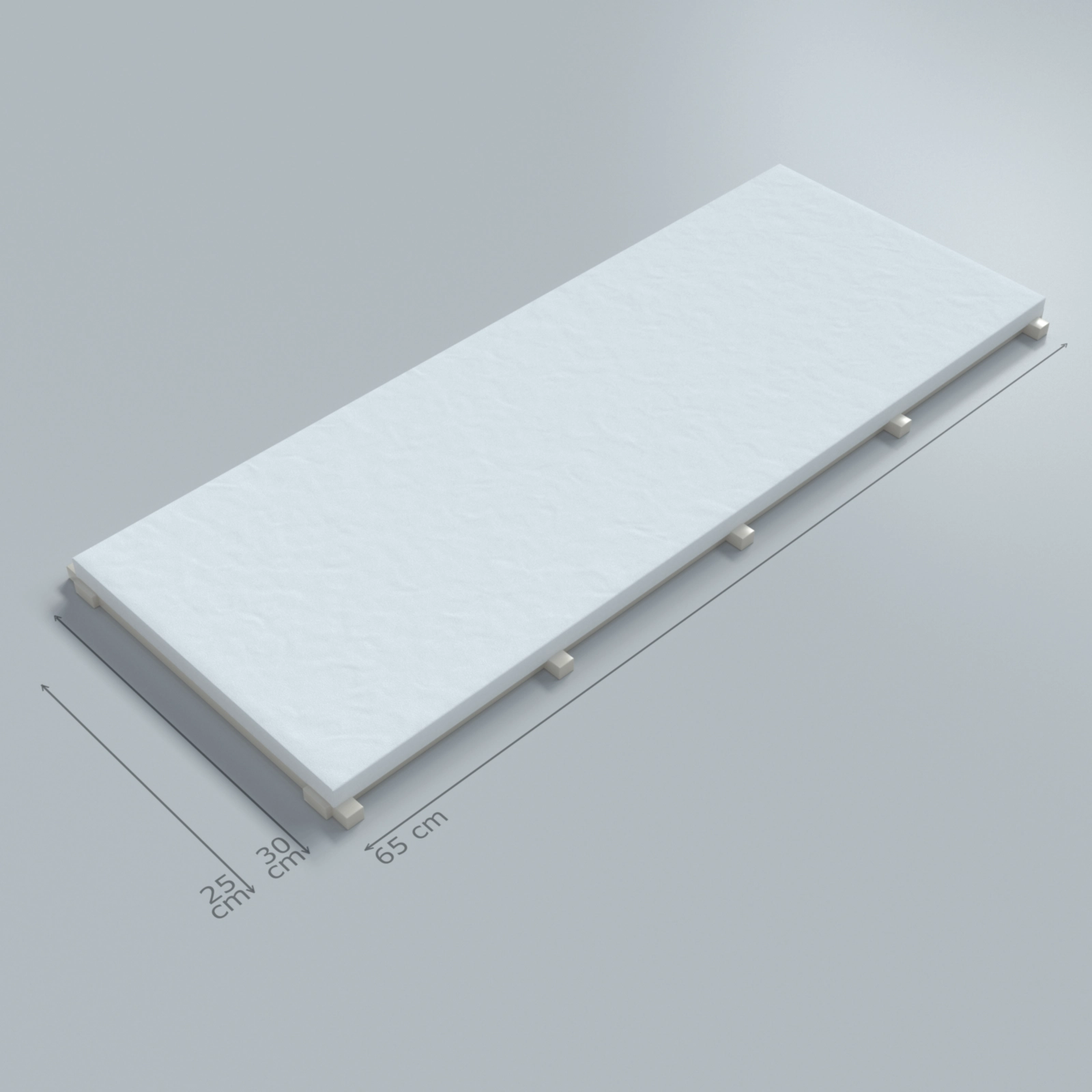
Relax White: The Character That Opens and Expands Water
Relax White is the polar opposite of Anthracite. A white frame doesn’t deepen the water’s color — it opens it. White surrounds amplify the pool’s reflective surface and increase the sense of brightness around it. They are the natural choice for Mediterranean architecture, Santorini-inspired villas, and any design chasing a “fresh, bright, inviting” feeling. White also reflects daylight, reducing heat buildup at the pool surround — a practical comfort advantage for barefoot walking in hot climates.
Relax White anchors the same fullbody system in the opposite direction. With grates, copings and linear overflow tiles in matching white tones, the surround “softens the stage” rather than dramatizing it. This approach especially suits SPA, wellness and family pools where the pool itself is meant to be the visual hero, while the frame stays calm and welcoming.
Detailed View: Why Does Fullbody Construction Matter So Much?
Both Relax Anthracite and Relax White are produced as fullbody porcelain. That means the color runs through the entire thickness of the tile, not just on the surface. Around the pool, this property turns into three practical advantages:
First, no color loss from wear. In high-traffic hotel pools or family pools where children run around constantly, micro-scratches that develop on the surface don’t create color contrast. Second, a high cutting tolerance. When grates, linear overflow tiles or coping profiles need to be cut on site, the cut surface still carries the same tone. Third, structural assurance against freeze-thaw cycles — a consistent mineral structure across the whole volume of the tile.
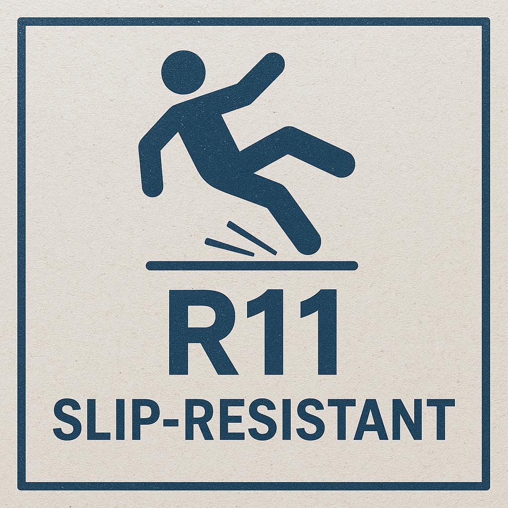
All these properties are made possible through production standards developed by Serapool. Low water absorption, high bending strength, R11 slip-resistance class and resistance to UV, chlorine and salt come together in a single product. The Serapool infrastructure is a critical reference point for delivering tonal consistency without batch differences in large-area applications — particularly decisive in long linear-overflow pools, where tonal mismatches would be impossible to hide.
Because both tones live within the same collection, building a project that combines a dark element (e.g., Anthracite grates) with a light surround (e.g., White terrace) is structurally simple — you don’t have to harmonize two different series.
Architectural Scenarios: Which Project Wants Which Tone?
The two tones serve genuinely different design intentions.
Projects suited to Relax Anthracite:
- Luxury hotel pools, especially designs that emphasize evening lighting
- Modern, minimalist villas — concrete- and glass-heavy compositions
- “Infinity pool” style linear-overflow systems (the disappearing edge reads stronger in anthracite)
- Projects where colored in-pool tiles (blue, turquoise, cobalt) are meant to feel dramatic
Projects suited to Relax White:
- Mediterranean, Aegean and Santorini-inspired villa pools
- Hotel SPA and wellness pools — for fresh, inviting atmospheres
- Shallow children’s pools — where a white frame helps with visibility and safety
- Boutique stays that emphasize daylight photography
A more decisive architect can also use both tones together; an Anthracite grate + White surround combination, for example, creates a powerful architectural contrast.
Maintenance, Hygiene and Longevity
Both colors are 100% porcelain — non-porous, stain-resistant, hygienic surfaces. Dark tones like Anthracite hide potential limescale traces in grout lines better than light ones. White tones, on the other hand, reveal possible “salt blooming” from chlorine more visibly — which is actually useful, because it gives early warning of when maintenance is due.
Resistant to chlorine, salt, disinfectants and UV exposure, both tones maintain their color and texture consistency for years. In practice: balanced pool water pH, gentle weekly brushing and seasonal deep cleaning are enough.
Poolarch’s Recommendation: Which Character Tells Your Story?
At Poolarch, we don’t recommend Relax Anthracite and Relax White as isolated colors — we recommend them through the lens of design intent. If you want the pool to be “the star of the stage” while the surroundings frame it quietly, Relax White is the answer. If you want the pool surround itself to carry a dramatic architectural character, Relax Anthracite. And if you want both intentions in the same project — say, a daytime-inviting and nighttime-dramatic pool — using both tones together makes both effects possible within a single Relax fullbody system.
These two tones are not just the endpoints of a color palette; used correctly, they are two quietly decisive technical characters that enable two completely different design languages within the same material family.
Wondering About Pool Tile Prices?
Pool ceramic prices, pool tile prices and pool porcelain prices vary on a project basis — depending on the chosen collection, the product group (in-pool tile, grate, coping, stair anti-slip), the square meterage and the overflow system applied. That’s why a single “per m²” figure you see online rarely reflects your actual project. At Poolarch, we give you a clear, transparent, project-specific quote based on the real dimensions and the collection you choose.
Get Your Per-m² Price Instantly — Quote Within 24 Hours
Reach out via WhatsApp, share your project’s dimensions and the color you have in mind; our specialist team will send you a per-m² quote for pool ceramic, pool tile and pool porcelain products within 24 hours. Tap to message us on WhatsApp for an instant quote.